
The best curtain color combinations depend on your room’s existing decor and the mood you want to create. Match curtains to wall colors for a seamless look, or choose contrasting hues like navy or emerald for drama. Light colors open up a room, while dark shades add coziness. Curtain color combinations are selections of curtain hues that match or contrast with a room’s existing decor to create visual harmony or impact.
What Should You Evaluate Before Choosing Curtain Colors?
Three things anchor a successful curtain color choice: walls, furniture, and bedding. According to Simply Windows, you should evaluate each before you commit to a shade. Walls form the largest color block in the room.
Wall color dictates whether you match for a seamless look or break away for contrast. Furniture wood tones and upholstery anchor the room’s temperature. Dark woods lean warm; light woods and painted finishes lean cool.
Bedding fabrics, patterns, and accent pillows set the soft palette. Curtains can echo these tones to build cohesion.
How Does Matching or Contrasting Curtain Colors Affect the Room?
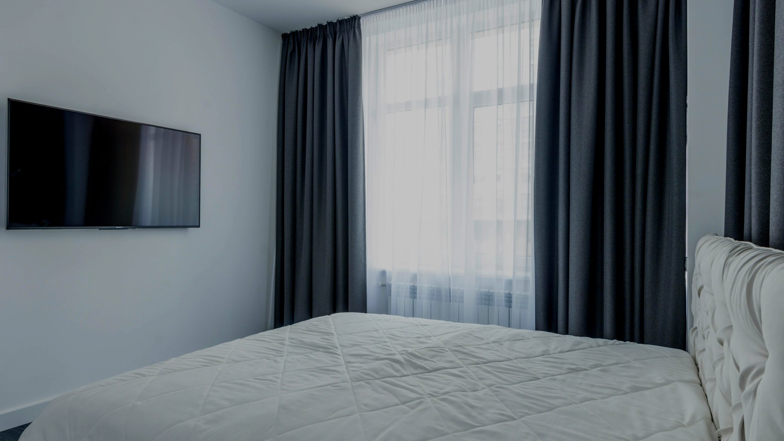
The next decision is whether to match the walls for a seamless look or choose a contrasting shade for more drama. Curtain colors that closely match wall colors create a seamless look and can make a room appear larger. The visual weight of the window dissolves, and the eye moves freely across the space, which is especially useful in small bedrooms.
Contrasting curtain colors add depth and visual interest. A deep charcoal against a warm white wall pulls the eye to the window and builds a focal point without adding clutter.
How Should Curtain Colors Coordinate with Furniture?
Dark wood furniture pairs well with warm, earthy curtain tones like terracotta, deep olive, or tobacco brown. These colors pull out the richness of the grain and keep the room feeling grounded. Light-colored furniture, whether pale oak, white lacquer, or soft grey upholstery, works best with cooler curtain shades — dusty blue, cool grey, or muted sage.
The combination keeps the space airy and prevents the furniture from feeling like a floating island. Curtains can also echo accent colors found in pillows, rugs, or artwork, creating a ribbon of repetition that ties the whole room together.
How Do Light and Dark Curtain Colors Affect Bedroom Mood?
Light curtain colors make a room feel more open and airy. White and off-white curtains reflect natural light to brighten a room, a reliable choice for north-facing bedrooms or spaces with limited windows. The fabric can feel weightless, drawing the wall color outward rather than stopping the eye at the frame.
Dark curtain colors create a cozy, intimate atmosphere. In large bedrooms with ample natural light, dark hues add drama and sophistication without shrinking the room. A deep charcoal or chocolate brown can wrap around a sleeping area and make the bed feel settled.
Which Specific Colors Enhance Calm, Warmth, or Sophistication?
Blue curtains are used for calming effects, with light blues being serene and dark blues adding depth. A washed denim blue feels fresh and quiet, while navy anchors the room and pairs effortlessly with crisp white trim. According to Simply Windows, gray curtains provide a modern and sophisticated aesthetic, especially in matte velvet or linen weaves.
Neutral tones including whites, grays, and beige create a calm environment. They absorb excess visual noise and let you switch out bedding or art without rethinking the entire window treatment. Taupe, brown, and olive green curtains create a warm, inviting atmosphere — olive reads as neutral without leaning cool or sterile.
Soft pastels are used for relaxation and rest, bringing a hint of color without overstimulating. Navy, emerald, and burgundy curtains can serve as a room’s focal point, drawing the eye instantly while still letting the rest of the decor stay quiet.
How to Use the Color Wheel for Curtain Combinations
To achieve these moods with precision, many designers turn to color wheel theory. Monochromatic schemes use different shades of the same color for a sophisticated look — for example, pairing pale gray walls with charcoal curtains and silver-gray bedding. The result is soft, layered, and intentionally calm.
Analogous color schemes use colors next to each other on the color wheel, such as green walls with yellow or teal curtains, creating gentle movement without high contrast. Complementary color schemes use opposite colors on the color wheel, such as blue and orange, for high contrast. That particular pairing feels energetic, so it works best in spaces where you want the curtains to be the room’s main visual anchor.
How to Coordinate Curtains with Bedroom Decor Styles
Minimalist decor typically uses neutral or monochromatic curtains to preserve clean lines. In a white-walled minimalist bedroom, textured curtains in linen or raw silk add dimension without breaking the quiet palette. Neutral rooms can be paired with neutral curtains in cream, beige, or gray, or they can be paired with bold colors like teal, mustard, or coral for a deliberate pop.
That unexpected choice works because a neutral backdrop gives a bright curtain license to be the room’s star. Bohemian style bedrooms benefit from vibrant, patterned curtains that layer easily with mixed textiles. Solid curtain colors are recommended when bedding has patterns.
Patterns on both the bed and the window tend to compete, so a quiet curtain grounds the look. Combining solid curtains with patterned valances or tiebacks creates a layered look.
FAQ
Q: What curtain color makes a room look bigger?
A: White or off-white curtains reflect natural light and create an airy feel, making a room appear larger. Matching curtains exactly to the wall color also visually expands the space.
Q: What are the best curtain colors for a calming bedroom?
A: Light blue, soft pastels, and neutral tones like gray and beige create a calm atmosphere. Blue is especially effective for serenity, while pastels promote relaxation.
Q: How do complementary colors work for curtain combinations?
A: Complementary colors sit opposite on the color wheel, like blue and orange. They create high contrast and visual interest, making curtains a bold focal point in the room.


