The Y2K Color Rebellion: Why We’re Leaving Quiet Luxury Behind
For the better part of a decade, fashion favored whispers. Beige, oat, stone, sand — the quiet-luxury movement asked us to disappear into a sea of neutrals. Summer 2026 flips that script entirely. The mood has shifted, and the y2k summer color trends making a comeback are loud, unapologetic, and delightfully familiar. After years of muted tones, the style set is reaching for shades that command attention. And though these hues may seem a little daring, each one pairs beautifully with the linen trousers, white tees, and denim staples already hanging in your closet.
What makes this resurgence different from the original Y2K moment is intention. Back then, these colors were everywhere because the era had no filter. Today, wearing them feels like a choice — a conscious decision to inject joy into your daily rotation. If you remember Barbie pink from Paris Hilton’s Juicy tracksuit era or canary yellow from Kate Hudson’s unforgettable dress in How to Lose a Guy in 10 Days, you already understand the emotional pull. These aren’t just colors. They carry memory triggers, mood boosters, and conversation starters.
The three shades leading the charge are Barbie pink, seafoam green, and canary yellow. Each offers a different energy, a different way to participate in the trend without looking like you raided a 2003 mall. Below, we break down how to wear each one, what to pair them with, and why they work so well for the coming season.
Barbie Pink: The Dopamine Darling
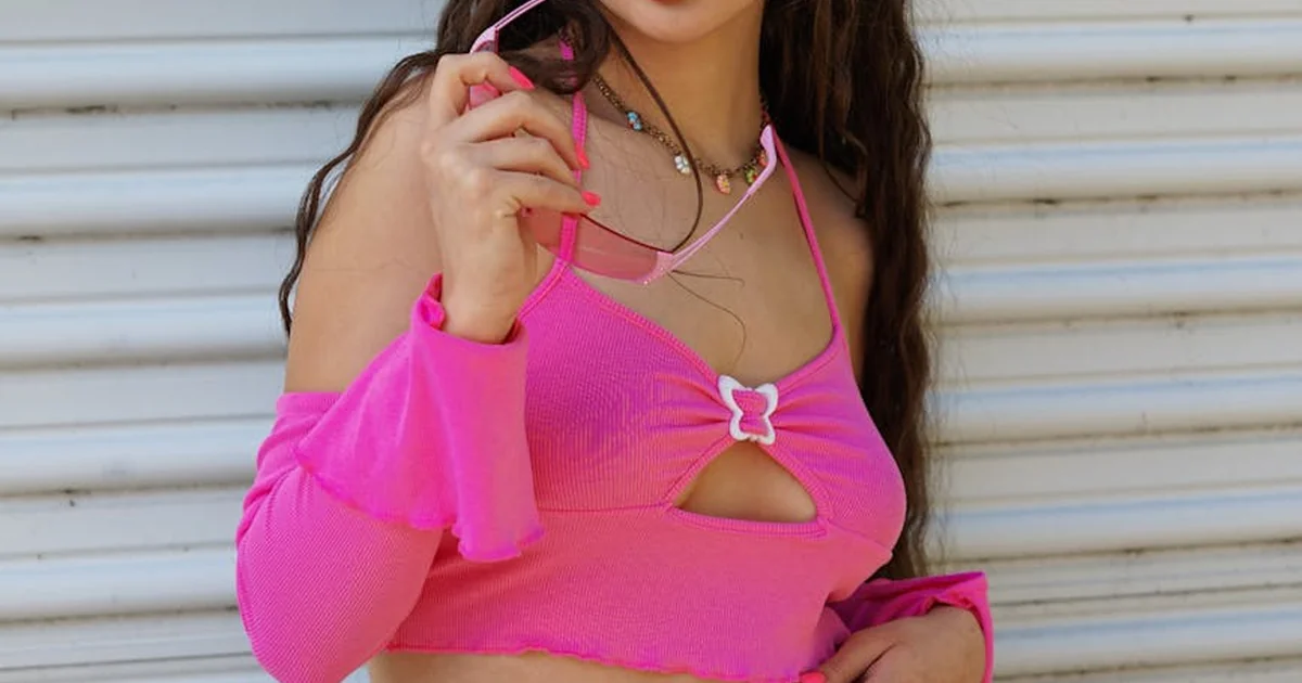
Barbie pink is having a moment that feels less like a trend and more like a homecoming. This is the hue that defined an entire generation of pop culture. Think Paris Hilton’s pink Bentley, the plastic fantastic aesthetic of the early aughts, and every Mean Girls scene featuring Regina George’s velour tops. In summer 2026, Barbie pink returns not as a gimmick but as a genuine style staple. Fashion insiders call it a dopamine-inducing shade for good reason — it literally lifts your mood the moment you put it on.
How to Wear Barbie Pink Without Feeling Costumey
The biggest concern people have about Barbie pink is that it might feel too tied to a specific decade or character. The trick is to avoid head-to-toe pink and instead let the color work as a feature piece. A pair of barrel-leg jeans in vivid pink creates a bold lower half while keeping the rest of your outfit neutral. A satin slip dress in this shade works beautifully for summer weddings or evening events, especially when accessorized with gold jewelry and simple sandals. The key is restraint elsewhere. Let the pink do the talking.
For those who want to dip a toe in first, consider a pink top tucked into cream wide-leg trousers or a structured pink blazer over a white tank and denim cutoffs. The contrast keeps the look fresh rather than nostalgic. If you’re attending a wedding this summer, a Barbie pink dress paired with neutral heels and a simple clutch will absolutely steal the show without crossing into costume vibes.
Pairing Barbie Pink with Neutrals for Everyday Wear
Barbie pink and white is a classic combination for a reason. The brightness of both shades amplifies each other, creating a look that feels clean and intentional. Try a pink column skirt with a crisp white button-down and leather sandals. For a slightly warmer feel, pair Barbie pink with beige or camel. A pink knit top over cream linen pants reads as sophisticated rather than flash rather than teenage nostalgia. The same goes for accessories — pink ballet flats with an all-white outfit add a pop of personality without overwhelming your aesthetic.
One practical approach for minimalists is to treat Barbie pink as your accent color across a neutral wardrobe. A single pink piece — a bag, a blazer, or even a pair of heels — transforms an all-beige outfit into something memorable. This is how you participate in the y2k summer color trends without abandoning your comfort zone.
Why Barbie Pink Resonates Now More Than Ever
Color psychology tells us that bright pinks trigger feelings of excitement, confidence, and playfulness. After a period where neutral tones dominated in response to economic uncertainty and a desire for understated luxury, the pendulum has swung back toward joy. People are craving visual stimulation. Barbie pink delivers. It also helps that the shade photographs beautifully under natural light, making it a favorite for outdoor summer gatherings, brunch dates, and beach days. The color simply glows in sunshine.
Seafoam Green: The Earthy Pastel
If Barbie pink is the extrovert of the group, seafoam green is the quiet observer. This muted, ethereal shade occupies a sweet spot between pastel and earth tone. It reminds many of the early aughts cult film Aquamarine or a particularly dreamy Britney Spears music video backdrop. But in summer 2026, seafoam green sheds its association with mermaid-core and emerges as a grown-up, sophisticated option for those seeking color without loudness.
What Makes Seafoam Green Different from Other Pastels
Most pastels lean cool or candy-sweet. Seafoam green contains enough gray and blue undertone to feel grounded. It doesn’t scream for attention the way mint on the runway. This makes it an excellent choice for people who want to embrace y2k summer color trends but prefer a palette that feels serene. Think of it as the calm alternative to Barbie pink. Where pink energizes, seafoam green soothes. In a season full of high-impact hues, this shade offers a visual breathing room that many wardrobe minimalists crave.
How to Make Seafoam Green Work with Warm-Toned Wardrobes
One common concern about seafoam green is that it appears to skew cool, which can clash with warm skin tones or wardrobes built around peach, coral, and camel. The solution lies in careful pairing. Combine seafoam green with warm neutrals like sand, terracotta, or soft beige to create balance. A seafoam green top tucked into rust-colored trousers feels intentional and modern. The same shade layered under a camel blazer works beautifully for transitional summer days.
Another approach is to use seafoam green as an accent in prints or accessories. A scarf, a bag, or a pair of earrings in this hue can bring a fresh dimension to an otherwise warm-toned outfit. For the committed minimal style enthusiast, this is the easiest entry point a small investment that yields a surprising return in visual interest.
Dressing Seafoam Green Up or Down
Seafoam green transitions effortlessly from casual to formal. During the day, wear it as a relaxed linen shirt tucked into white shorts with flat sandals. The effect is airy and effortless. For evening, a seafoam green satin midi skirt paired with a cream silk camisole and strappy heels creates an aura of understated elegance. The color catches light differently than standard pastels, giving fabrics a luminous quality that photographs beautifully at golden hour. This particular tone is so calming yet so distinctive at the same time.
If you remember seafoam green from the early aughts, you likely associate it with glossy lips, low-rise denim, and girly accessories. The modern update swaps those elements for clean lines, natural fabrics, and sophisticated silhouettes. The color remains the same. The context evolves.
Canary Yellow: The Sunshine Statement
Last summer belonged to butter yellow — a soft, milky shade that felt safe and approachable. This year, canary yellow takes the throne. Where butter yellow whispered, canary yellow shouts. It’s intense, full of contrast, and capable of brightening even the cloudiest day. Canary yellow appeared prominently on the Spring/Summer 2026 runways and has already woven through collections from countless brands. From handbags to tennis skirts to ballet flats, this saturated shade screams summer with every wear.
What Makes Canary Yellow Different from Butter Yellow
The difference is pigment depth. Butter yellow contains white, softening its personality. Canary yellow contains more pure yellow pigment, giving it a high-voltage effect that demands attention. This is not a color that fades into the background. It is a focal point, which means you need to style it deliberately. The payoff, however, is immense. No other shade in this trio photographs as vividly or reads as confidently in social situations.
If you hesitated to try butter yellow because it felt too washed out against your skin tone, canary yellow might surprise you. Its saturation means it holds its own against both warm and cool complexions. The key is finding the precise tone. Slightly warmer canary yellows flatter olive and golden skin tones. Cooler canary yellows with a hint of green undertone work well for fair and pinkish skin.
You may also enjoy reading: 5 Bridal Nail Trends from Laufey’s 2026 Met Gala.
The Best Neutral Pairings to Tone Down Canary Yellow
To make canary yellow wearable for everyday life, lean into high-contrast neutrals. White is the most obvious partner — a canary yellow dress with white accessories feels instantly resort-ready. Cream soft grey creates a more subdued look. A canary yellow top tucked into grey tailored trousers tones down the brightness while keeping the outfit elevated. Black works too, but it transforms the energy from playful to dramatic. For daytime, stick with white, cream, or light grey.
Another technique is to use canary yellow in smaller doses. A canary yellow handbag with an all-white outfit makes a statement without requiring you to commit to the color head to toe. Canary yellow ballet flats peeking out from under cream linen trousers add a pop of personality. This approach works well for professionals who want to bring y2k summer color trends into their work wardrobe without feeling costume. Even a canary yellow headband or scarf can transform a neutral outfit into something memorable.
Canary Yellow for Summer Events and Travel
Canary yellow shines at daytime events. A midi dress in this shade is perfect for picnics, garden parties, outdoor brunches, or a day at the races. The color reads festive without trying too hard. For travel, a canary yellow linen blouse packed alongside neutral bottoms creates multiple outfit options with minimal luggage. The color also makes you easier to spot in a crowd, which is an underrated benefit for group trips or busy public spaces.
If you want to color-block, canary yellow pairs surprisingly well with Barbie pink creates a high-impact duo that feels distinctly Y2K but entirely modern. The general rule when mixing brights is to keep silhouettes simple and avoid introducing a third bright color. Let the two shades shine. For a more approachable look, try canary yellow with seafoam green — the warmth of yellow against the coolness of green creates a natural visual harmony that feels organic and seasonal.
How to Wear Y2K Colors Without Looking Dated
The biggest challenge with any nostalgia trend is avoiding the trap of looking like you’re in costume. The y2k summer color trends of summer 2026 succeed because they borrow only the palette, not the accompanying styling. You won’t find chunky plastic jewelry, overly distressed denim, or sky-high platform flip-flops here. Instead, these colors are dressed in modern cuts and quality fabrics.
Choose One Saturated Piece per Outfit
Until you feel confident with brights, limit yourself to one saturated Y2K color per outfit. Put on a Barbie pink skirt and keep your top, shoes, and accessories neutral. Add a canary yellow bag and let everything else stay quiet. This approach ensures the color remains the focal point. As you grow comfortable, try pairing two of these colors together. Just remember to keep the third piece neutral to avoid visual overload.
Invest in Quality Fabrics
Bright colors reveal fabric quality more than neutrals do. A cheaply synthetic materials can read as cheap when used in vivid shades. Look for natural fibers like linen, ramie, cotton, satin, and quality viscose. These fabrics hold dye differently, giving the color depth rather than flatness. A canary yellow linen blouse looks intentional and luxe. A polyester version of the same shade can veer into costume territory. The same applies to seafoam green and Barbie pink.
Mix with Your Existing Neutrals
You don’t need a complete wardrobe overhaul. Each of these three colors works beautifully with the neutrals you already own. Barbie pink with beige. Canary yellow with white. Seafoam green with cream or olive. The key is to let your existing pieces ground the brightness. A pink satin dress with brown leather sandals and a straw bag looks perfectly of the moment. Green linen trousers with a-line skirt with a cream button-down reads fresh and modern. These combinations keep your wardrobe functional while allowing you to participate in the season’s most exciting shift.
Consider Your Setting
Bright colors carry different weight in different environments. A seafoam green blouse works for a casual office environment. A Barbie pink dress is perfect for a brunch outing or daytime party. Canary yellow shines best in well-lit outdoor spaces where its luminosity can glow naturally. Think about where you will wear each piece before committing to a purchase. That helps ensure your new color additions get regular rotation rather than languishing in the back of your closet.
More Than a Trend: The Emotional Value of Y2K Colors
Fashion cycles often reflect larger cultural moods. The shift from quiet luxury to bold, joyful color suggests that despite global uncertainty, people are choosing to embrace what brings them happiness. Color psychology research indicates that exposure to bright hues can improve mood, increase confidence, and even foster social connection. The y2k summer color trends for 2026 are not just about looking good. They are about feeling good.
The Y2K era itself was marked by a sense of playful optimism. By revisiting its color palette, we reconnect with a time that felt less guarded, more open to self-expression. That emotional resonance is what separates these trends from short-lived fads. Barbie pink, seafoam green, and canary yellow carry stories and memories. Wearing them with intention, they become more than colors. They become mood.
Whether you choose full saturation or subtle accents, this summer offers a rare chance to step away from the safety of neutrals and into something bolder. The sun is returning, the calendar is filling, and your wardrobe is ready for a refresh. Dive in one shade at a time, and let the brightness do the rest.


